
The Challenge
HomeSight aimed to help seniors live independently longer with an AI Smart Home, but adoption lagged due to a limited user interface. Our challenge was to transform HomeSight’s powerful hardware into a desirable and intuitive TV and web experience that provided support and confidence to patients and caregivers, fitting seamlessly into homes and care facilities.
My Role
As design lead, I defined the UX strategy and vision to drive adoption, created the core framework for both the TV and Portal, and led end-to-end design for the Portal, while a teammate focused on detailing the TV features.
The Results
Unlike most monitoring systems, we took a lifestyle-driven approach by adapting a network of sensors and communication systems to the natural setting and behavior of people managing chronic conditions. The ecosystem has a nearly invisible experience, passively collecting data for caregivers and communicating with patients where they interact most, on their TVs.
1
3.5 Billion
How we did it
Identify key barriers to adoption and reshape the MVP capabilities with a more desirable experience design.
stakeholder interviews
Hueristic Evaluation
Initial concepts
tradeoff testing
(11 participants over 60 with chronic conditions)
Final design
Discovery
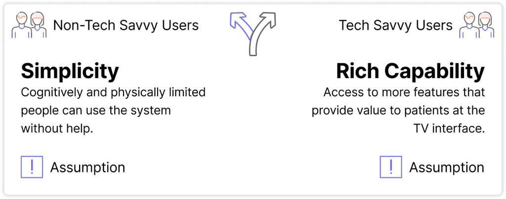
HomeSight, originally a hardware company, built powerful AI IoT tech that detects in-home behavior without compromising privacy. Their first UI partner, Kraydel Konnect, failed due to poor execution—clunky navigation, oversimplified interactions, and limited value for both patients and caregivers. To succeed, HomeSight needed a customizable default UX layer that was simple yet capable, engaging yet respectful, and valuable to both patients and caregivers.


Key issues for patient interface (TV)
Too simple to see value in the features (ex: Health screen only shows current and last reading)
Clunky yes/no navigation system is confusing and takes more clicks to get to desired feature, causing frustration
Tone of interface excludes more capable users, but features are not tailored for someone with memory loss (ex: contacts only shows the user name and system role)


Key issues for caregiver interface (web portal)
The landing page lacks patient status. Family caregivers typically see only one tile, making the page irrelevant, while facility caregivers see 10+ and need a quick way to spot who needs attention. Currently, they have to click into each tile to find out.
The movement chart does not provide any insight beyond active hours, and it is limited to ‘Yesterday’ and ‘Today’


Design Iterations
Tradeoff testing
Testing Extreme Concepts
Everyone could agree that the Kraydel Konnect was overly simplified and overly supportive in tone, so we created a concept that leaned toward the opposite extreme, an efficiency-driven concept focused on optimizing daily routines.

Concept 1: Highly Simplified with Custom Controls for Non-Tech Savvy Users
Only one option is presented on the screen at a time, using large illustrations to communicate the meaning and reinforce the supportive brand tone.
The remote was limited to Yes, No, and Menu, intended for a self-explanatory question/answer navigation system.


Concept 2: Efficiency-Driven Using Familiar Interaction Patterns
Interface highlights multiple options at once, showing key features are highlighted with time-sensitive content above the fold. Additional content is in scrollable categories like modern streaming platforms.
The remote uses a traditional D-pad along with some hot keys to go to primary features.
Testing Results
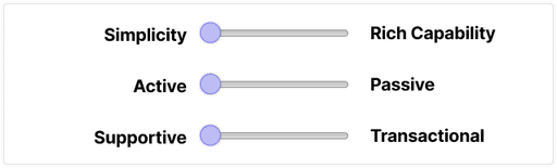
The new concept was strongly preferred. Its more transactional, assistant-like tone felt useful without being patronizing, while Konnect’s simplicity made users feel underestimated. Users also favored a passive engagement model with occasional key touchpoints, but the all-in-one-page layout was too complex. A simplified homepage with clearly defined sections struck the right balance.


Too Simple
Users found the simple concept offensive. Consistently, reporting that they would not use it.

Efficiency and Familiar Controls
The efficiency concept allowed users to see the value of the system beyond health monitoring. The users felt like this was a natural extension of their phone and they liked the idea of having access to key information and reminders on their TV.

Passive engagement model
Users preferred the system using key touchpoints like turning on the TV and time-based alerts, prioritizing normal TV watching. Full page alerts and buried access to the TV function were seen as a negative.

The all-in-one home page was too complex.
Users recommended simplifying the homepage to only have the content above the fold.
The Refined Design
We restructured the system to deliver a relatable and empowering value: a helpful assistant to guide your day. The vision was guided by the user-defined balance of tradeoffs and the recommended refinements for each feature.
The UX Vision
CHAMELEON
Seamlessly integrates into different environments to the point of being invisible
ASSISTANT
A personified role that predicts needs (considering environmental, physical, and cognitive challenges) and notifies users to reduce anxieties and burdens of health management and increase
SOOTHING
A positive and stress-reducing influence. The system should feel friendly, calm, and subtle, not high energy.
NOT CONDESCENDING
It needs to feel simple and friendly, but not so much so that it makes people feel defensive about their age or capability
TV Interface for Patients
The system is designed to be minimally disruptive, making the most of key touchpoints like turning on the TV or getting notifications. When the user is directly interacting with the system, navigation and visuals are thoughtfully designed for users with limited mobility or cognitive capacity while maintaining a tone of dignity and independence.

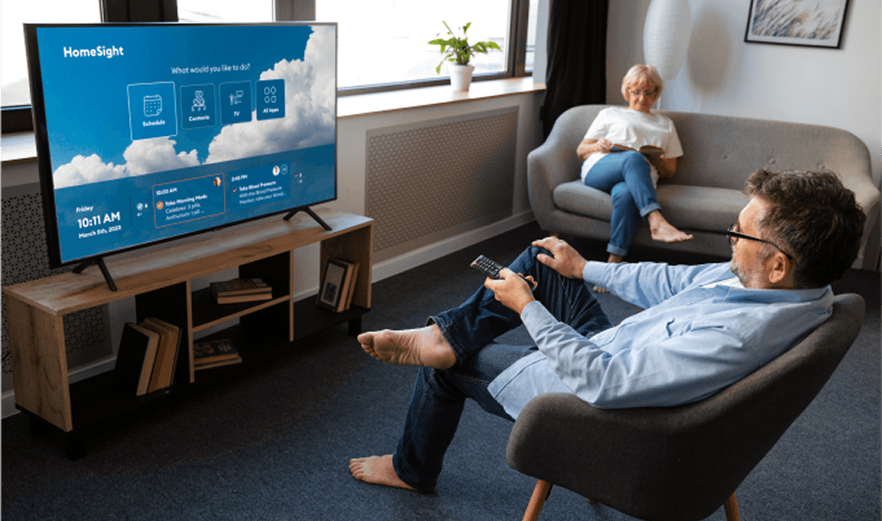
Turning on the TV
When users turn on the TV, they’re greeted with a personalized schedule and gentle prompts to engage in healthy routines, before transitioning to regular TV programming or the home screen.
The home screen was updated based on the testing feedback, only to include key launch points and upcoming events.
The background video changes with the weather forecast to create a soothing tone while remaining informative.
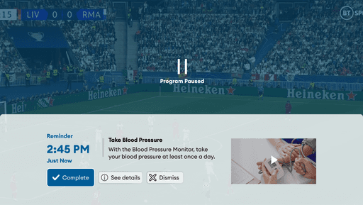
Interactions while Watching TV
Key health compliance and schedule reminders are triggered during TV viewing or when the user is sensed in the room, allowing users to benefit from the system without having to directly interact with it. Reminders embed helpful content like directional videos to improve compliance.


Video calling
Communication tools are front and center, making it easier to stay connected and engaged.
Contacts include pictures, labels, and recent call history to remind patients with memory or cognitive impairments.
Videos automatically apply captions to support hearing impairments
Web Portal Interface for Caregivers
Caregivers have new insights into patient activity through the portal or their favorite communication channels, text, email, or zoom. The Caregiver Portal is designed to provide status quickly and scale from single patients to care facilities with many patients.


Landing page
Page adapts so that the landing page provides immediate insight into patients' wellbeing, no matter the number of patients.
If the user has many patients, a list is on the right, prioritizing the patients that need attention in a group at the top of the page.
If the user is only assigned to one patient, a patient status tile is highlighted in the primary navigation and the primary page space shows a combined schedule of your patient and care team.


Patient Inisghts
HomeSight provides patient data collected from sensors around the house and connected medical devices. The information is highlighted in a quick color-coded preview with access to details in trend graphs for individual measurements and activity graphs for data that is consistently monitored.

Made for Teamwork
Caring for the elderly is often a group activity split amongst loved ones. This is commonly done in group chats, making it hard to track who is taking care of what and when. We integrated communication tools in the schedule so caregivers can see what the patient needs and determine who can help and assign the task in the schedule.


